# Package names
packages <- c("tidyverse","tidyquant","tidymodels","glue","scales", "ggthemes","highcharter")

# Install packages not yet installed
installed_packages <- packages %in% rownames(installed.packages())

if (any(installed_packages == FALSE)) {
  install.packages(packages[!installed_packages])
}

# Load all packages
lapply(packages, library, character.only = TRUE)Data Visualization
About this Document
This file replicates the codes that have been discussed in the live-session lectures of the Practical Applications in Quantitative Finance course. To ensure you can run the codes without issues, please install and load all required packages beforehand. It is always a good practice to replicate this Quarto document and experiment by making edits to the parameters. At the end of this report, you will find a suggestion on how to tweak this report — try doing some changes on your own!
Attention
In this lecture, we will be using the FANG dataset, which contains basic stock information from popular U.S. techonology firms: Facebook (Meta), Amazon, Netflix, and Google (Alphabet). Instead of loading the data from a .csv file, we will be loading data from a .txt file using the read_delim() function from readr, a package that is included in the tidyverse. Before you start, make sure to follow the instructions from our previous replication to set up your working directory correctly.
Loading packages
As we get started, we will be loading all packages referred in our official website.
Note that you could easily get around this by installing and loading all necessary packages using a more simple syntax:
#Install if not already available - I have commented these lines so that R does not attempt to install it everytime
  #install.packages('tidyverse')
  #install.packages('tidyquant')
  #install.packages('glue')
  #install.packages('scales')
  #install.packages('ggthemes')

#Load
  library(tidyverse)
  library(tidyquant)
  library(tidymodels)
  library(glue)
  library(scales)
  library(ggthemes)
  library(highcharter)
Data Visualization in R
The ggplot2 is a system for declaratively creating graphics, based on The Grammar of Graphics. The Grammar of Graphics, developed by Leland Wilkinson, is a structured approach to visualization where:
- Data is mapped to aesthetic attributes (e.g., color, shape, size)
- A geometric object (geom) represents data visually (e.g., points, lines, bars)
- Statistical transformations (stats) summarize data
- Scales control how data is mapped to visual properties
- Facets split data into panels for comparison
Key Highlights
- It is, by and large, the richest and most widely used plotting ecosystem in the language
ggplot2has a rich ecosystem of extensions - ranging from annotations and interactive visualizations to specialized genomics - click here a community maintained list
The ggplot2 foundations
We will illustrate the use of ggplot2 to replicate the Grammar of Graphics foundations using the FANG dataset. To load it into your R session, hit the download button and load it using read_delim('FANG.txt') or download the FANG.txt file directly on eClass®. To get ggplot2 in your session, either load tidyverse altogether of directly load the library:
#Load the tidyquant package
library(tidyquant)

#Option 1: load the tidyverse, which includes ggplot2
library(tidyverse)

#Option 2: load ggplot2 directly
library(ggplot2)


FANG=read_delim('FANG.txt')Step 1: the data
First and foremost, in our call to ggplot, we need to make sure that it knows where the data is located. We will be using the FANG dataset, which contains basic stock information from popular U.S. techonology firms: Facebook (Meta), Amazon, Netflix, and Google (Alphabet). The first step in using ggplot2 is to call your data dataframe and supply the aesthetic mapping, which we’ll refer to as aes
ggplot(data=your_data, aes(x= variable_1, y=variable_2, ...))- The
dataargument refers to the dataset used - The
aesargument contains all the aesthetic mappings that will be used
Together, these constitute the backbone of your visualization: they tell ggplot2 what the raw information to be used and where it should be mapped! For example, we can create another object, META, filtering for observations from FANG where symbol=='META' and chaining this the newly created dataset onto ggplot, mapping the date variable in the x axis, adjusted variable in the y axis, and symbol in the group aesthetic:
#Read the data
FANG=read_delim('FANG.txt')

#Let's use Apple (META) adjusted prices
META=FANG%>%filter(symbol=='META')

#Use ggplot2 to map the aesthetics to the plot
ggplot(META, aes(x=date,y=adjusted,group=symbol))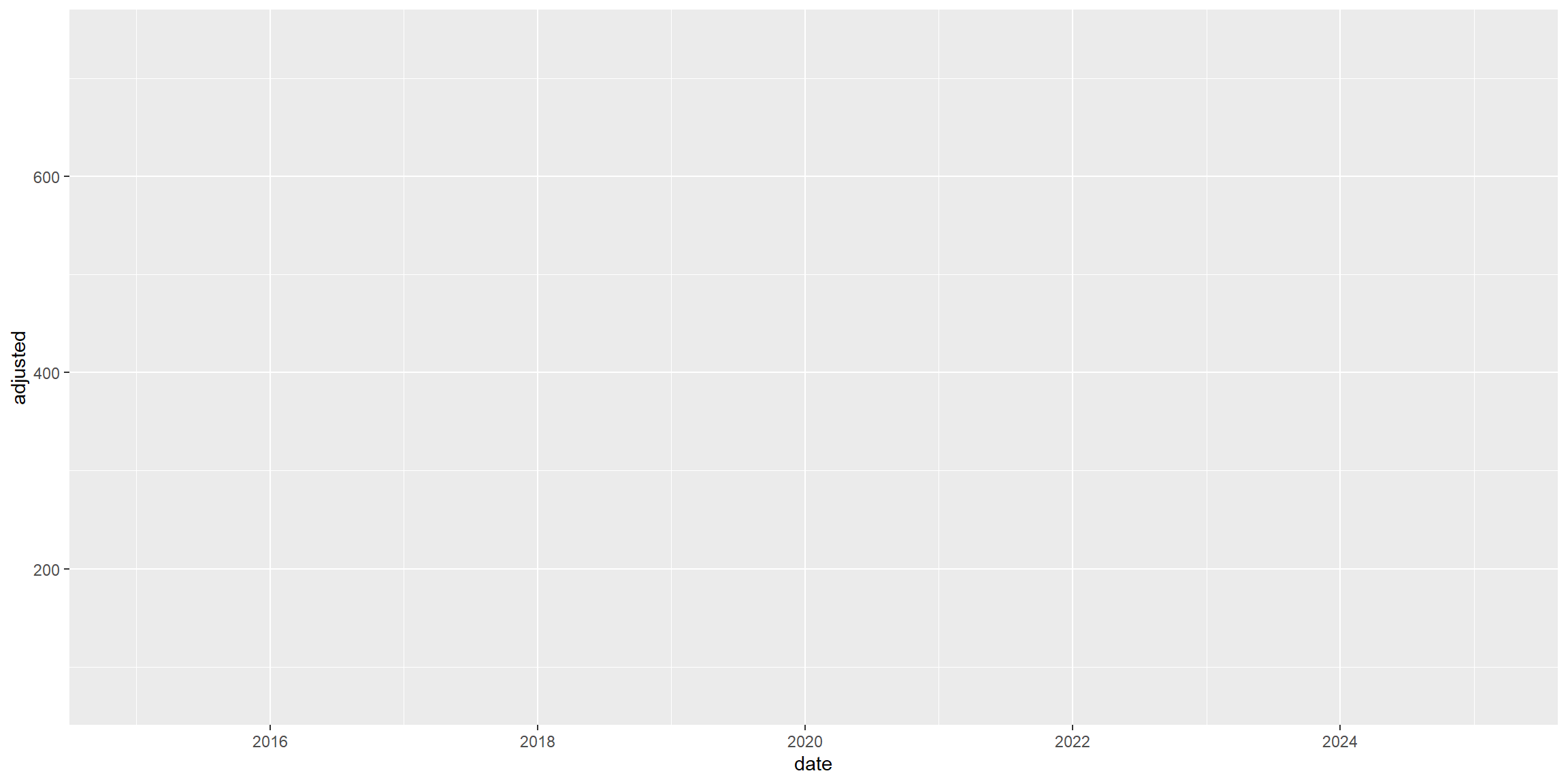
Step 2: adding your geom
You probably thought you did something wrong when you saw an empty chart with the named axis, right? However, I can assure: you did great! It is all about the philosophy embedded in the Grammar of Graphics: you first provide the data and the aes(thetic) mapping to your data. Now, ggplot knows exactly which information to select and where to place it. However, it is still agnostic about how to display it. We will now add a geometry layer - in short, a geom:
Adding layers on top of a
ggplot object
- You can add layers on top of
ggplotobject addition symbol (+) - There are many types of potential geometries, to name a few:
geom_point(),geom_col(),geom_line()- click here for a complete list
A layer combines data, aesthetic mapping, a geom (geometric object), a stat (statistical transformation), and a position adjustment. Typically, you will create layers using a geom_{} function, overriding the default position and stat if needed. With your ggplot call, use the + operator to add a geometry layer on top of the actual empty ggplot chart - in this case, we will be using the geom_line() geometry:
#Use ggplot2 to map the aesthetics to the plot and add a geom_line()
ggplot(META, aes(x=date,y=adjusted,group=symbol)) +
geom_line()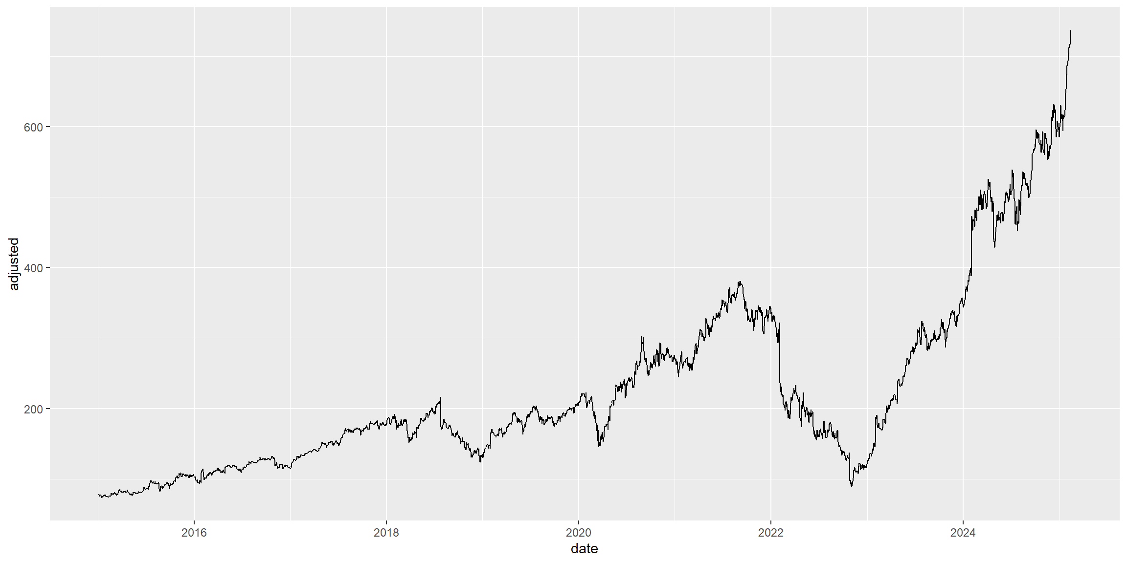
Step 3: be creative with additional layers
Your main chart is now all set: it contains the data and the necessary aes(thetic) mappings to the chart, and it also contains a shape, or geom(metry), that was selected to display the data. What’s next? The philosophy behind the Grammar of Graphics is now to add layers of information on top of the base chart using the + operator, like before.
We will proceed by including several layers of information that will either add or modify the behavior of the chart, making it more appealing to our audience:
- Adding trend lines using
geom_smooth() - Adding annotations and labels using
annotationandlabs - Modifying the behavior of the scales using
scale_yandscale_x
#Use ggplot2 to map the aesthetics to the plot
ggplot(META, aes(x=date,y=adjusted,group=symbol)) +
geom_line()+
#Adding a trend
geom_smooth(method='loess')+
#Adding Annotations
labs(title='META adjusted prices',
     subtitle = 'Source: Yahoo! Finance',
     x = 'Year',
     y = 'Adjusted Prices')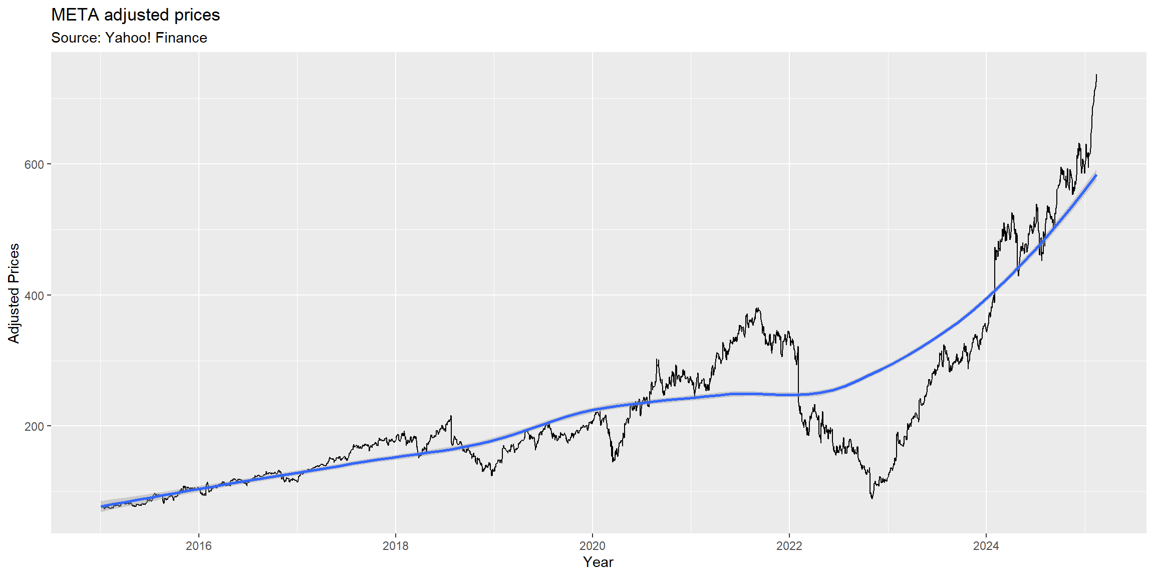
More annotations
Apart from simply changing the labels of your axis, titles and subtitles, you can also use ggplot2 to customize the appearance of your axis: 1. The family of functions scale_x_{} apply a given structure to the x-axis - e.g, scale_x_date(),scale_x_continuous() 2. The family of functions scale_y_{} apply a given structure to the y-axis - e.g, scale_y_continuous() etc
With that, you can, for example:
- Force the x-axis to be formatted as a date, adjusting how it is being displayed
- Force the y-axis to be formatted in terms of dollar amounts
In this way, you can impose meaningful structures in your chart depending on the type of data you are considering in your mapping to x and y axis! Say, for example, that you want to format the x-axis to show breaks at the year level, and the y-axis in such a way that it goes from \(\small\$0\) to \(\small\$1,000\) by increments of \(\small\$50\). You can do so by adding the following syntax to your ggplot object:
  #Your previous ggplot call up to now
  {your_previous_ggplot} +
  #Changing the behavior of scales
  scale_x_date(date_breaks = '1 year',labels = year) +
  scale_y_continuous(labels = dollar, breaks = seq(from=0,to=1000,by=50))
Click here to see comprehensive list of all customizations that can be done across both x-axis and y-axis for continuous scales (
scale_x_continuous()andscale_y_continuous())Click here to see comprehensive list of all customizations that can be done across both x-axis and y-axis for date scales (
scale_x_date()andscale_y_date())
Formatting scales
To properly format the appearance of your axis, make sure to have the scales package properly installed and loaded. You can do so by calling install.packages('scales') and library(scales).
#Let's use Meta (META) adjusted prices
META=FANG%>%filter(symbol=='META')

#Use ggplot2 to map the aesthetics to the plot
ggplot(META, aes(x=date,y=adjusted,group=symbol)) +
geom_line()+
#Adding a trend
geom_smooth(method='loess')+
#Adding Annotations
labs(title='META adjusted prices',
     subtitle = 'Source: Yahoo! Finance',
     x = 'Year',
     y = 'Adjusted Prices')+
#Changing the behavior of scales
scale_x_date(date_breaks = '1 year',labels = year) +
scale_y_continuous(labels = dollar, breaks = seq(from=0,to=1000,by=50))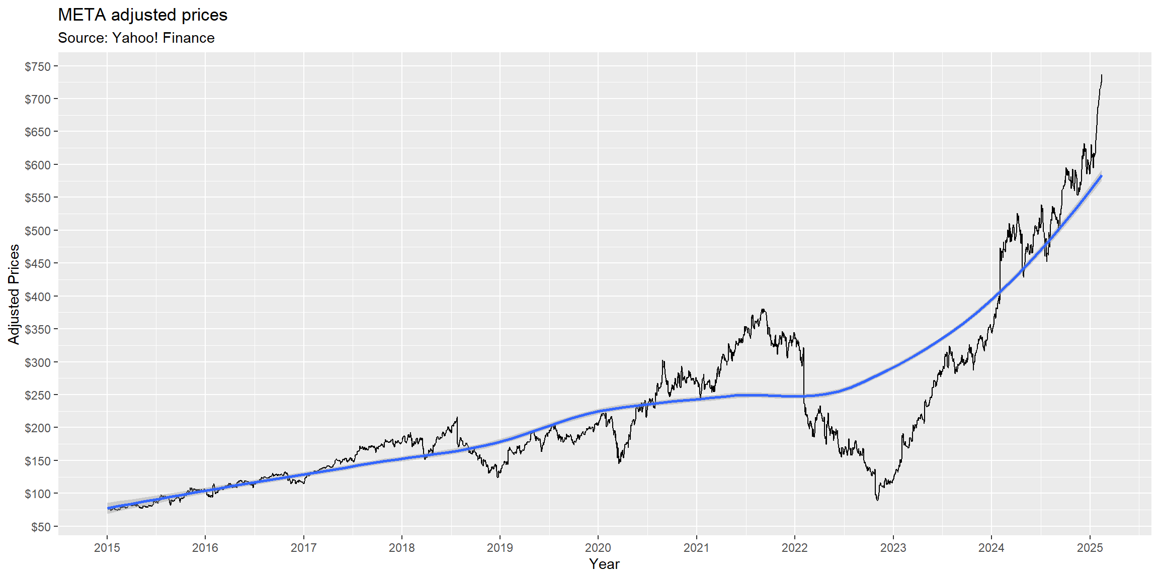
Adding multiple data points
What if we wanted to add more data? In our first example, we set filter(symbol)=='META' to select only information from Meta to your chart. However, one might be interested in understanding how did Meta perform relative to its FANG peers.m It is easy to do it with ggplot:
- Because you have set
group=symbol,ggplotalready knows that it needs to group by each different string contained in the ticker column - In such a way, all you need to do is to add a new
aesmapping,colour=symbol, so thatggplotknows that eachsymbolneeds to have a different color!
In what follows, we will be charting all four FANG stocks in the same chart, adjusting the layers to try keeping aesthetics as good as possible.
#Make sure that date is read as a Date object
FANG=FANG%>%mutate(date=as.Date(date))

#Use ggplot2 to map the aesthetics to the plot using the full FANG data
ggplot(FANG, aes(x=date,y=adjusted,group=symbol,colour=symbol)) +
  #Basic layer - aesthetic mapping
  geom_line()+
  #Adding a trend
  geom_smooth(method='loess')+
  #Adding Annotations
  labs(title='FANG adjusted prices',
       subtitle = 'Source: Yahoo! Finance',
       x = 'Year',
       y = 'Adjusted Prices')+
  #Changing the behavior of scales
  scale_x_date(date_breaks = '1 year',labels = year) +
  scale_y_continuous(labels = dollar, breaks = seq(0,1000,50))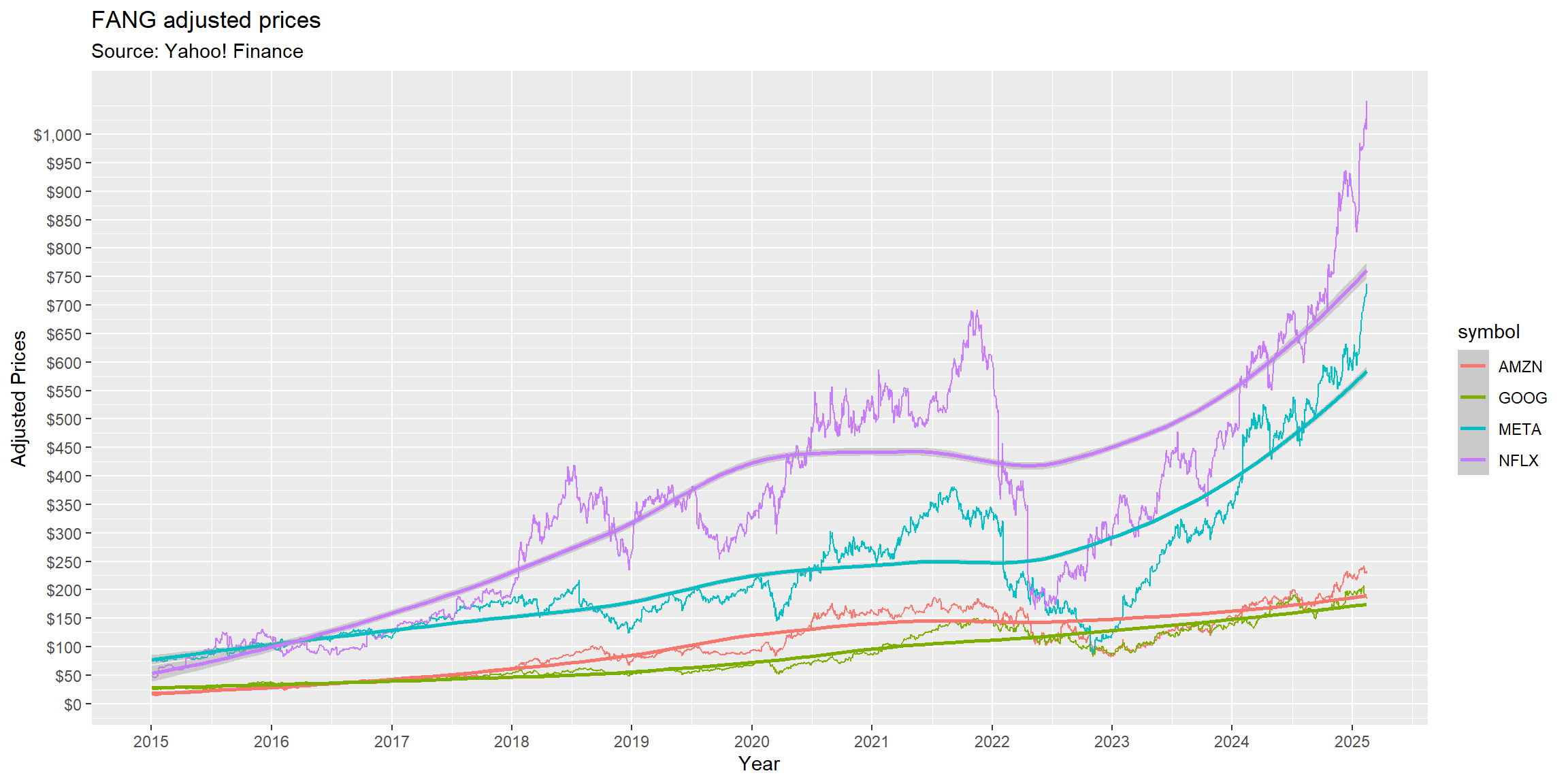
Facet it until you make it
We have included all FANG stocks into the same chart. Easy peasy, lemon squeezy!. As far as we could go on adjusting the layers, it seems that the chart conveys too much information:
- Because of the different scales, you can hardly tell the different between AMZN AND GOOG during 2015-2018
- Furthermore, trend lines are, in some cases, effectively hiding the data undernearth
Although you could easily remove the trend lines, ggplot2 also comes with a variety of alternatives when it comes to charting multiple data that may come in handy:
- You can facet your chart using
facet_wrap, controlling the axis as well as the number of rows and columns - You can grid your chart, making the comparison easier with fixed axes
#Make sure that date is read as a Date object
FANG=FANG%>%mutate(date=as.Date(date))

#Use ggplot2 to map the aesthetics to the plot using the full FANG data
ggplot(FANG, aes(x=date,y=adjusted,group=symbol,colour=symbol)) +
  #Basic layer - aesthetic mapping
  geom_line()+
  #Adding a trend
  geom_smooth(method='loess')+
  #Facet the data: try experimenting scales: free_y or fixed
  facet_wrap(facets=symbol~.,ncol=2,nrow=2,scales='free_y')+
  #Adding Annotations
  labs(title='FANG adjusted prices',
       subtitle = 'Source: Yahoo! Finance',
       x = 'Year',
       y = 'Adjusted Prices')+
  #Changing the behavior of scales
  scale_x_date(date_breaks = '1 year',labels = year) +
  scale_y_continuous(labels = dollar)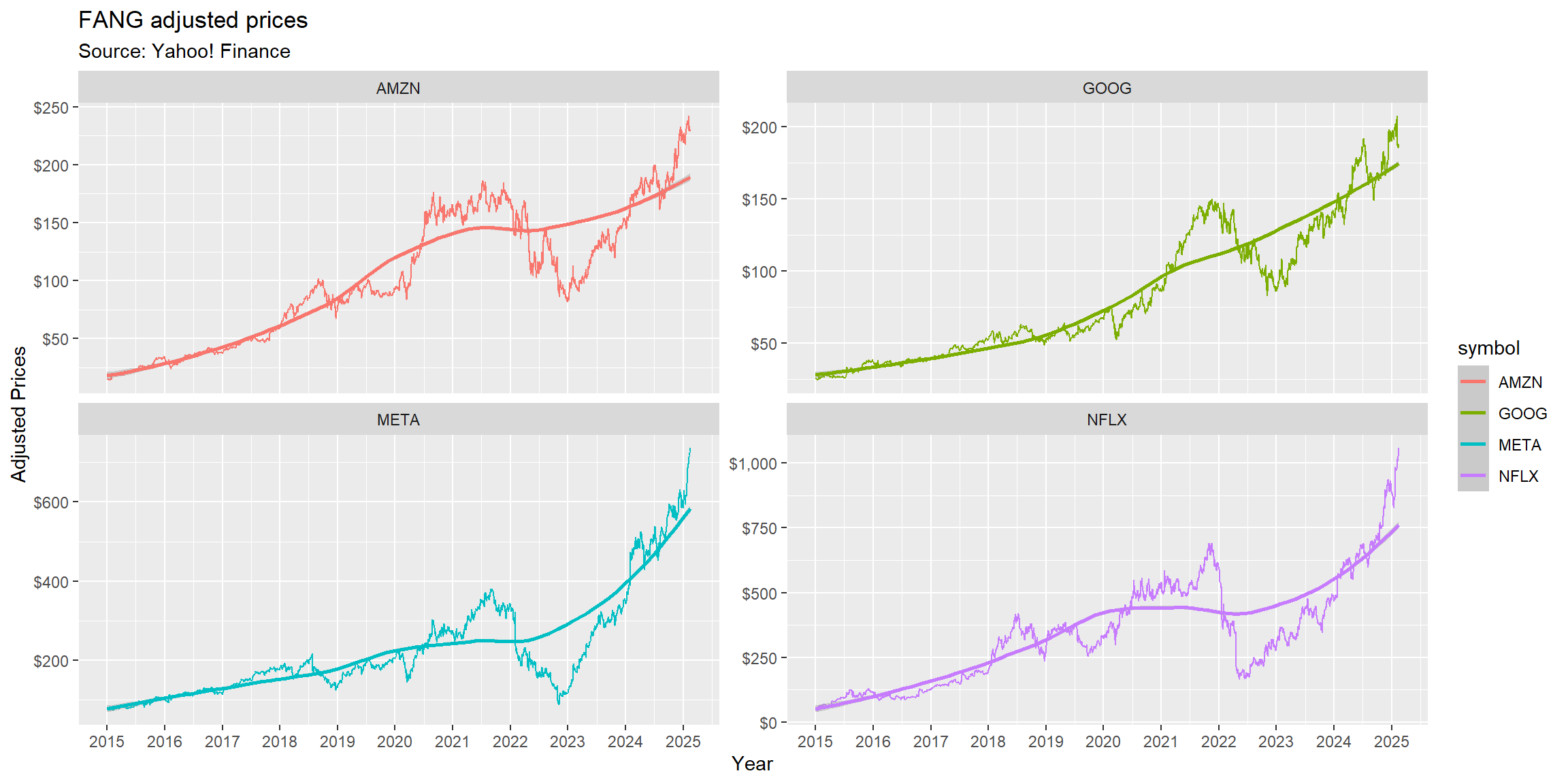
#Make sure that date is read as a Date object
FANG=FANG%>%mutate(date=as.Date(date))

#Use ggplot2 to map the aesthetics to the plot using the full FANG data
ggplot(FANG, aes(x=date,y=adjusted,group=symbol,colour=symbol)) +
  #Basic layer - aesthetic mapping
  geom_line()+
  #Adding a trend
  geom_smooth(method='loess')+
  #Facet the data: try experimenting vertical orientation (.~symbol) and horizontal orientation (symbol~.)
  facet_grid(rows=.~symbol,scales='fixed')+
  #Adding Annotations
  labs(title='FANG adjusted prices',
       subtitle = 'Source: Yahoo! Finance',
       x = 'Year',
       y = 'Adjusted Prices')+
  #Changing the behavior of scales
  scale_x_date(date_breaks = '1 year',labels = year) +
  scale_y_continuous(labels = dollar, breaks = seq(0,1000,250))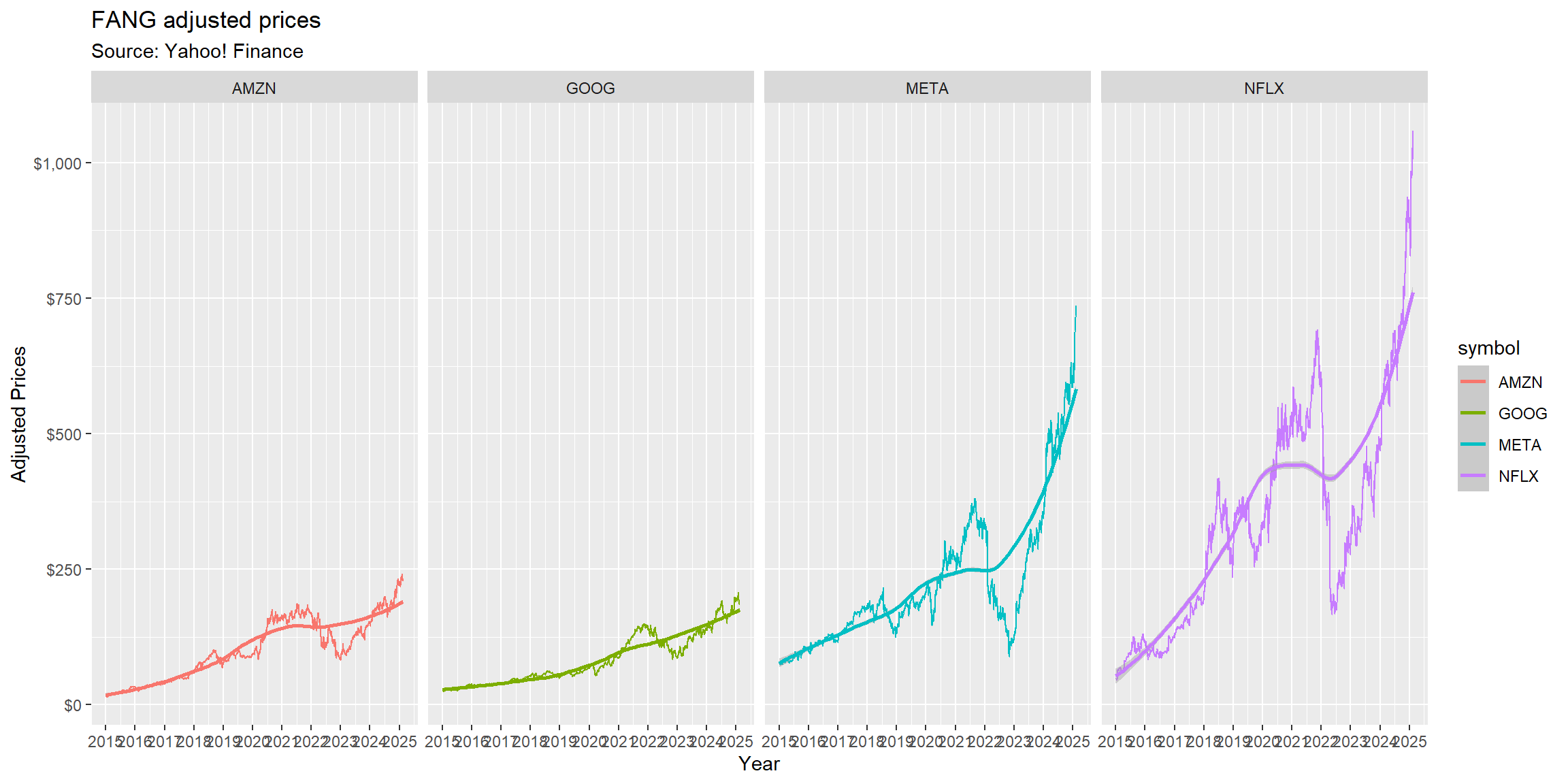
Adding themes: you’re in full control of your message!
By now, you are already looking like a data manipulation wizard in your firm:
- You have created a fully automated data ingestion process using
tq_get()to get live FANG prices. - Set up
ggplotto automatically update the chart; - Finally, you have adjusted all aesthetics to make it more much more professional
A lot of the ggplot adoption throughout the R usiverse relates to themes: complete configurations which control all non-data display: first, there are a lot of available themes that you can pass to your ggplot, like theme_minimal(), theme_bw(). Alternatively, you can pass theme() if you just need to tweak the display of an existing theme.
For example, the code below adds theme_minimal(), a predefined theme that is loaded together with ggplot2, to further customize the appearance of the chart:
#Make sure that date is read as a Date object
FANG=FANG%>%mutate(date=as.Date(date))

#Use ggplot2 to map the aesthetics to the plot using the full FANG data
ggplot(FANG, aes(x=date,y=adjusted,group=symbol,colour=symbol)) +
  #Basic layer - aesthetic mapping
  geom_line()+
  #Adding a trend
  geom_smooth(method='loess')+
  #Facet the data: try experimenting scales: free_y or fixed
  facet_wrap(facets=symbol~.,ncol=2,nrow=2,scales='free_y')+
  #Adding Annotations
  labs(title='FANG adjusted prices',
       subtitle = 'Source: Yahoo! Finance',
       x = 'Year',
       y = 'Adjusted Prices')+
  #Changing the behavior of scales
  scale_x_date(date_breaks = '1 year',labels = year) +
  scale_y_continuous(labels = dollar)+
  #Using the theme_minimal() theme configuration that comes with ggplot2
  theme_minimal()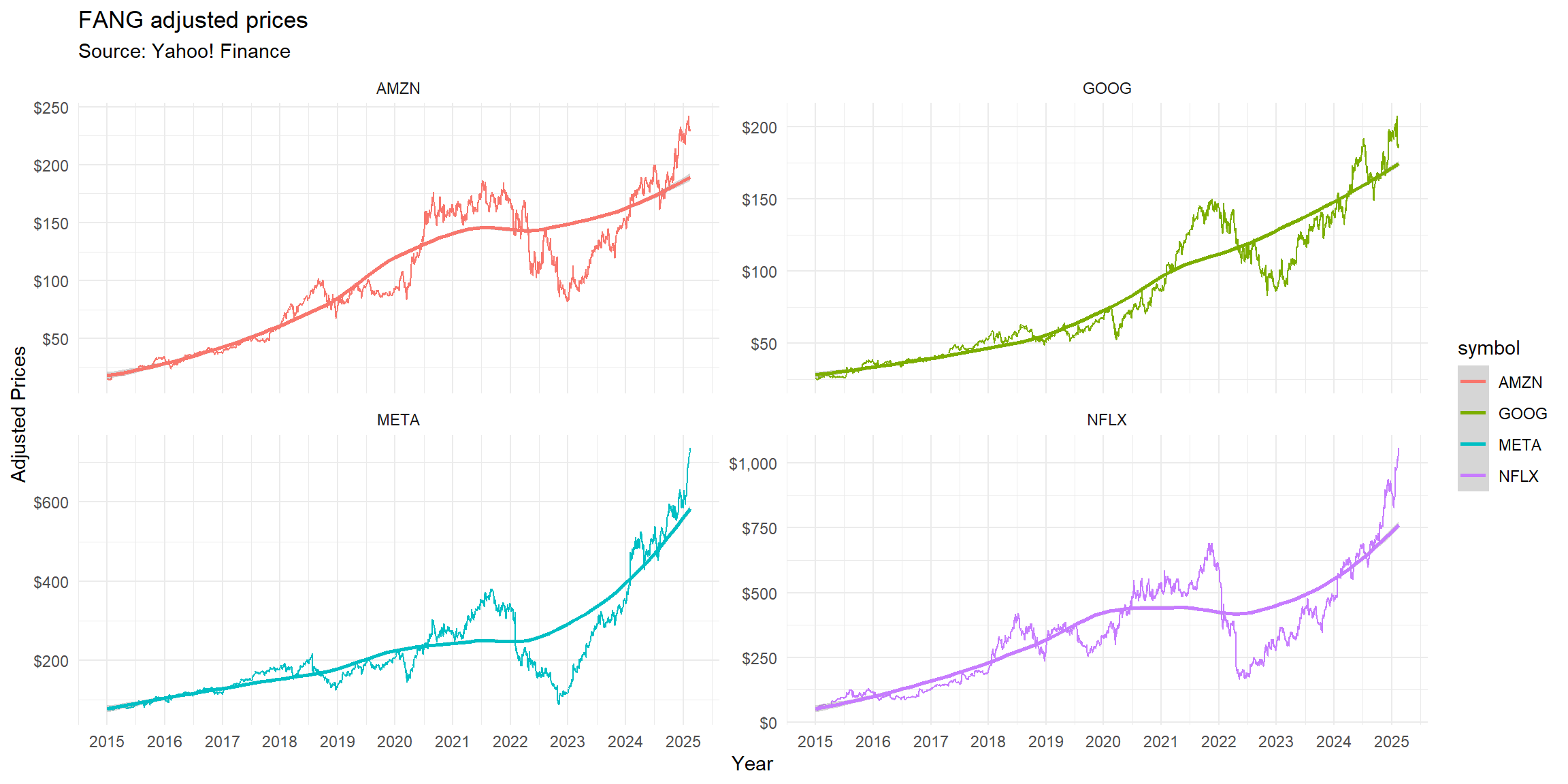
There are endless customizations that you could think of that could be applied to a theme. In special, the package ggthemes provides extra themes, geoms, and scales for ggplot2 that replicate the look of famous aesthetics that you have often looked and said: “how could I replicate that?”
To get access to these additional graphical resources in your R session, install and load the package using:
install.packages('ggthemes') #Install if not available
library(ggthemes) #Load

your_previous_ggplot_object + theme_{insertyourtheme}
To check all available themes, check the ggthemes library here website. Below, you can find the same visualization using distinct themes coming from the ggthemes library:
#Make sure that date is read as a Date object
FANG=FANG%>%mutate(date=as.Date(date))

#Use ggplot2 to map the aesthetics to the plot using the full FANG data
ggplot(FANG, aes(x=date,y=adjusted,group=symbol,colour=symbol)) +
  #Basic layer - aesthetic mapping
  geom_line()+
  #Adding a trend
  geom_smooth(method='loess')+
  #Facet the data: try experimenting scales: free_y or fixed
  facet_wrap(facets=symbol~.,ncol=2,nrow=2,scales='free_y')+
  #Adding Annotations
  labs(title='FANG adjusted prices',
       subtitle = 'Source: Yahoo! Finance',
       x = 'Year',
       y = 'Adjusted Prices')+
  #Changing the behavior of scales
  scale_x_date(date_breaks = '1 year',labels = year) +
  scale_y_continuous(labels = dollar)+
  #Try out all available themes
  theme_wsj()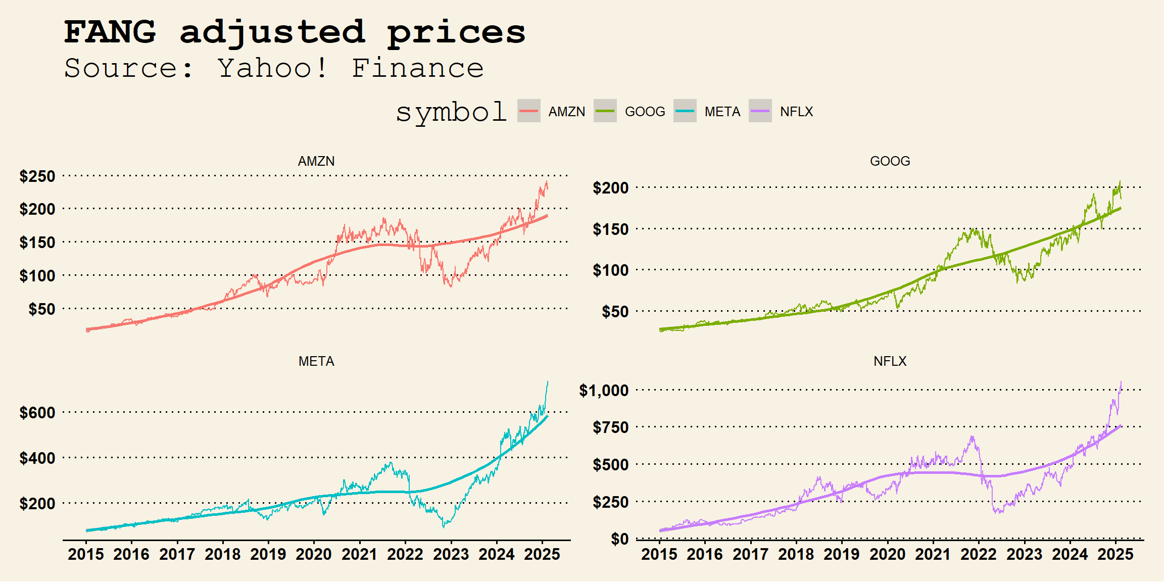
#Make sure that date is read as a Date object
FANG=FANG%>%mutate(date=as.Date(date))

#Use ggplot2 to map the aesthetics to the plot using the full FANG data
ggplot(FANG, aes(x=date,y=adjusted,group=symbol,colour=symbol)) +
  #Basic layer - aesthetic mapping
  geom_line()+
  #Adding a trend
  geom_smooth(method='loess')+
  #Facet the data: try experimenting scales: free_y or fixed
  facet_wrap(facets=symbol~.,ncol=2,nrow=2,scales='free_y')+
  #Adding Annotations
  labs(title='FANG adjusted prices',
       subtitle = 'Source: Yahoo! Finance',
       x = 'Year',
       y = 'Adjusted Prices')+
  #Changing the behavior of scales
  scale_x_date(date_breaks = '1 year',labels = year) +
  scale_y_continuous(labels = dollar)+
  #Try out all available themes
  theme_economist()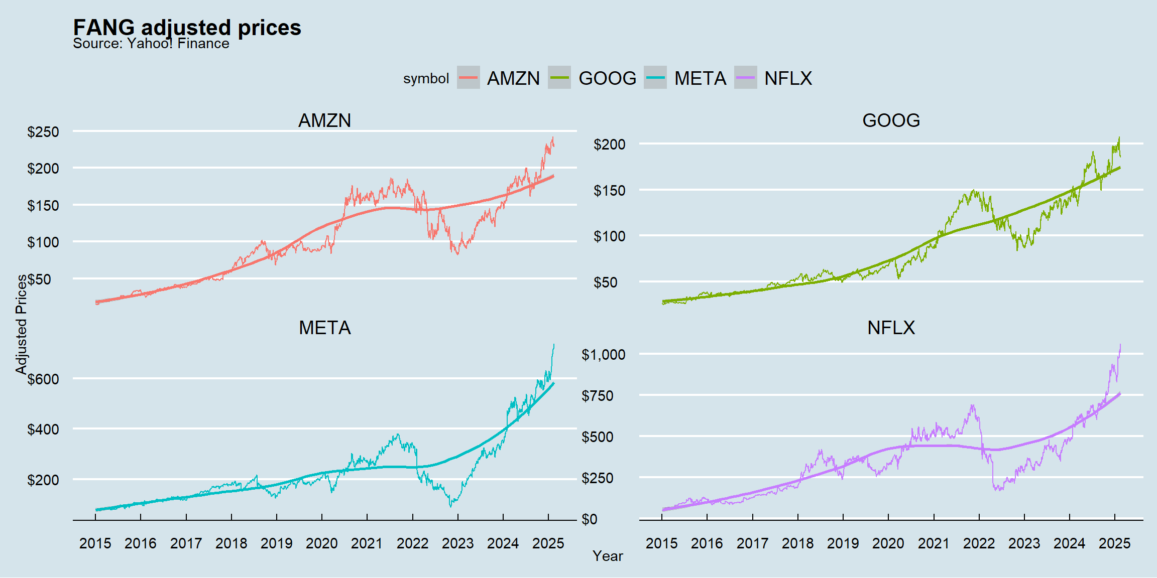
#Make sure that date is read as a Date object
FANG=FANG%>%mutate(date=as.Date(date))

#Use ggplot2 to map the aesthetics to the plot using the full FANG data
ggplot(FANG, aes(x=date,y=adjusted,group=symbol,colour=symbol)) +
  #Basic layer - aesthetic mapping
  geom_line()+
  #Adding a trend
  geom_smooth(method='loess')+
  #Facet the data: try experimenting scales: free_y or fixed
  facet_wrap(facets=symbol~.,ncol=2,nrow=2,scales='free_y')+
  #Adding Annotations
  labs(title='FANG adjusted prices',
       subtitle = 'Source: Yahoo! Finance',
       x = 'Year',
       y = 'Adjusted Prices')+
  #Changing the behavior of scales
  scale_x_date(date_breaks = '1 year',labels = year) +
  scale_y_continuous(labels = dollar)+
  #Try out all available themes
  theme_excel()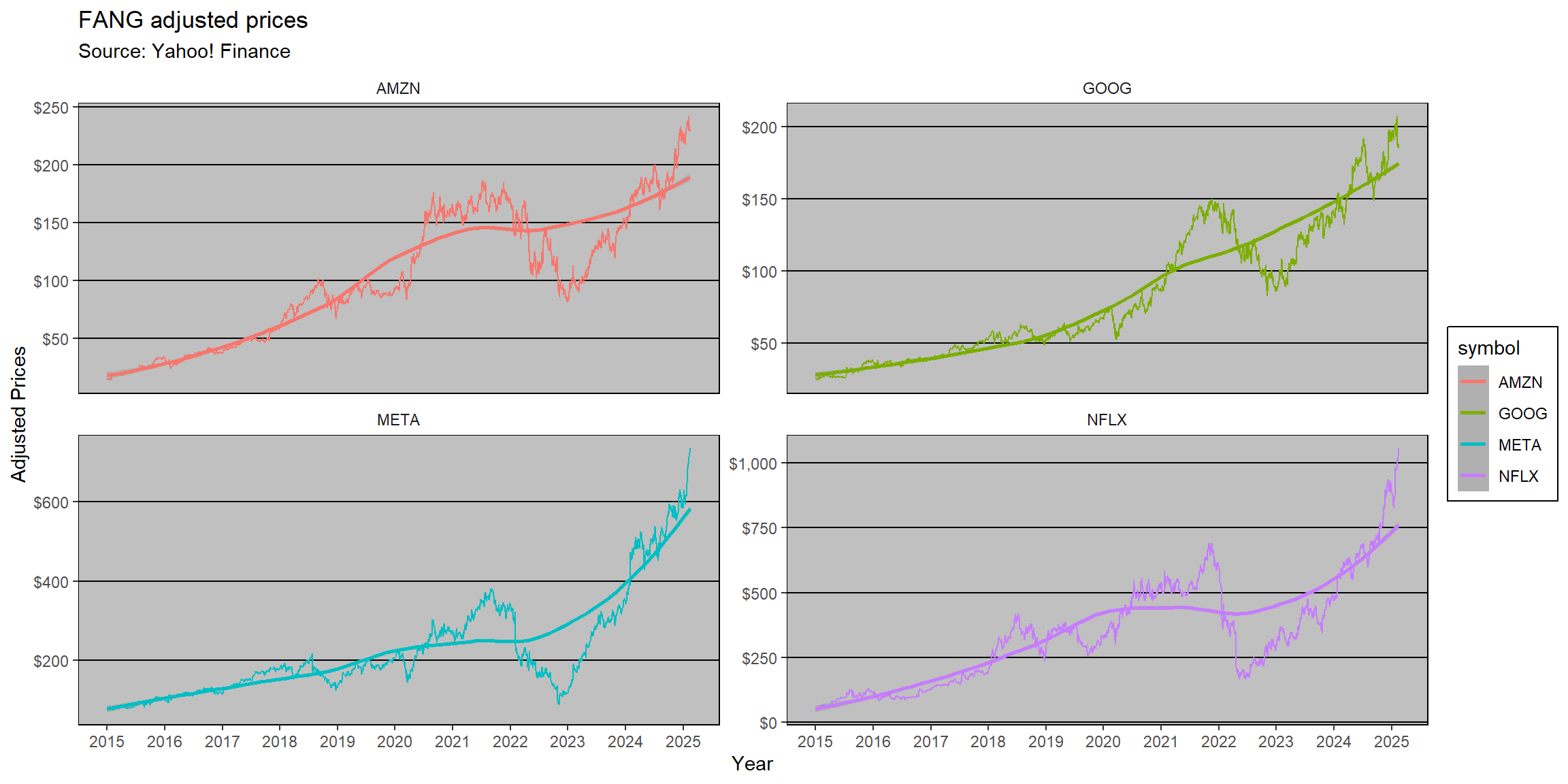
#Make sure that date is read as a Date object
FANG=FANG%>%mutate(date=as.Date(date))

#Use ggplot2 to map the aesthetics to the plot using the full FANG data
ggplot(FANG, aes(x=date,y=adjusted,group=symbol,colour=symbol)) +
  #Basic layer - aesthetic mapping
  geom_line()+
  #Adding a trend
  geom_smooth(method='loess')+
  #Facet the data: try experimenting scales: free_y or fixed
  facet_wrap(facets=symbol~.,ncol=2,nrow=2,scales='free_y')+
  #Adding Annotations
  labs(title='FANG adjusted prices',
       subtitle = 'Source: Yahoo! Finance',
       x = 'Year',
       y = 'Adjusted Prices')+
  #Changing the behavior of scales
  scale_x_date(date_breaks = '1 year',labels = year) +
  scale_y_continuous(labels = dollar)+
  #Try out all available themes
  theme_fivethirtyeight()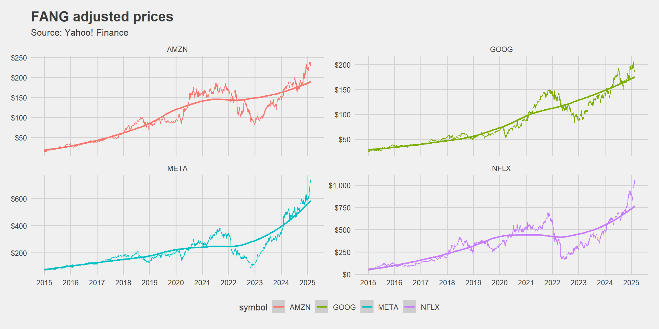
#Make sure that date is read as a Date object
FANG=FANG%>%mutate(date=as.Date(date))

#Use ggplot2 to map the aesthetics to the plot using the full FANG data
ggplot(FANG, aes(x=date,y=adjusted,group=symbol,colour=symbol)) +
  #Basic layer - aesthetic mapping
  geom_line()+
  #Adding a trend
  geom_smooth(method='loess')+
  #Facet the data: try experimenting scales: free_y or fixed
  facet_wrap(facets=symbol~.,ncol=2,nrow=2,scales='free_y')+
  #Adding Annotations
  labs(title='FANG adjusted prices',
       subtitle = 'Source: Yahoo! Finance',
       x = 'Year',
       y = 'Adjusted Prices')+
  #Changing the behavior of scales
  scale_x_date(date_breaks = '1 year',labels = year) +
  scale_y_continuous(labels = dollar)+
  #Try out all available themes
  theme_gdocs()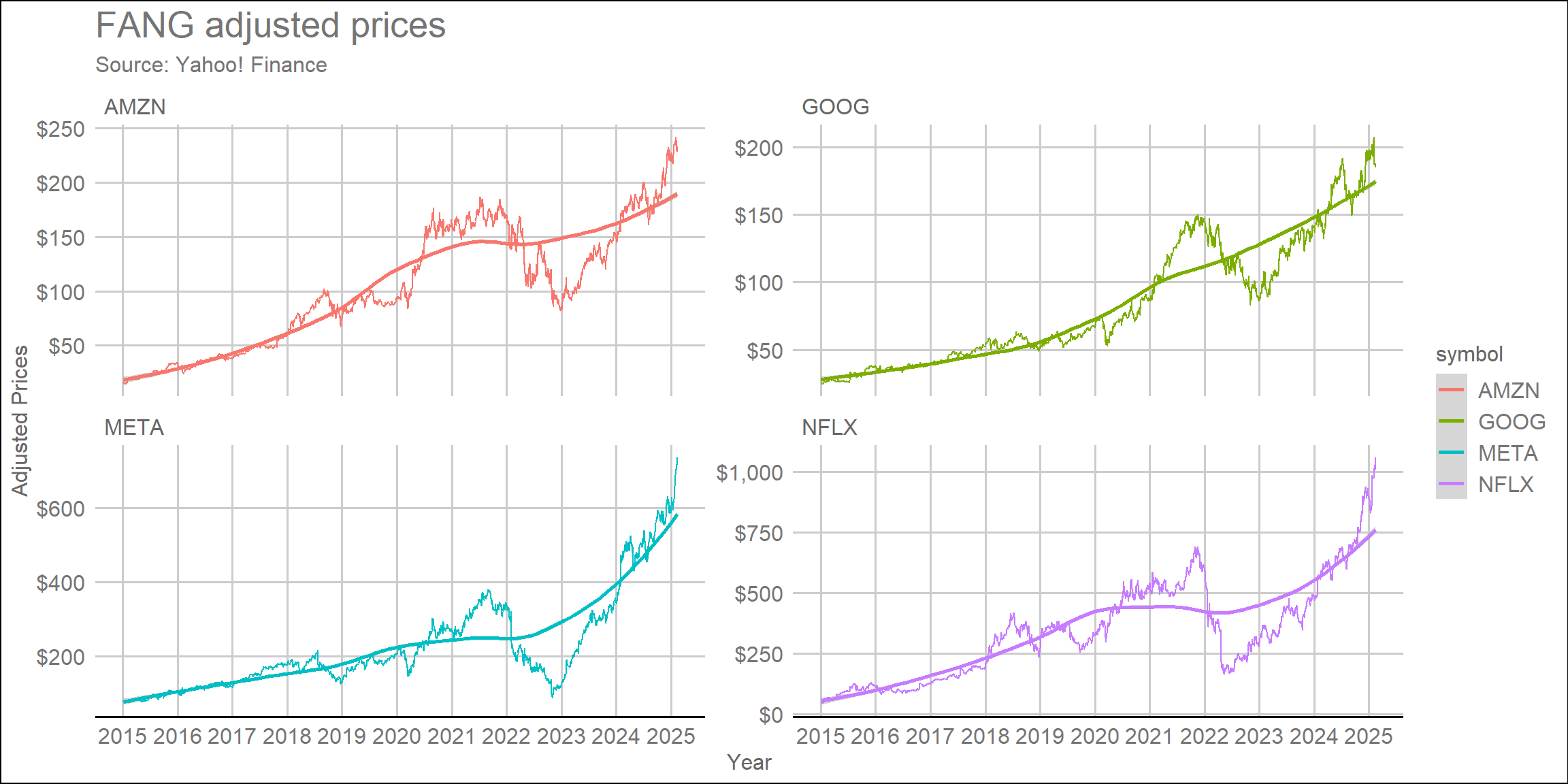
Integrating tidyquant
Like in our previous lecture, the tidyquant added very important functionalities for those who work in finance to easily manage financial time series using the well-established foundations of the tidyverse. When it comes to data visualization, tidyquant also provides a handful of integrations that can be inserted into your ggplot call:
- Possibility of using
geom_barchartandgeom_candlestick - Moving average visualizations and Bollinger Bands available using
geom_maandgeom_bbands - A new theme,
theme_tq, available
The code below shows an example of how tidyquant objects can be chained on a ggplot call to generate meaningful visualization of financial time series. Say, for example, that you wanted to understand how each FANG stock behaved during the DeepSeek announcement. You could use the geom_candlestick() and geom_ma() functions with its appropriate arguments to a purely financial visualization:
#Set up start and end dates
end=Sys.Date()
start=end-weeks(5)

FANG%>%
  #Make sure that date is read as a Date object
  mutate(date=as.Date(date))%>%
  #Filter
  filter(date >= start, date<=end)%>%
  #Basic layer - aesthetic mapping including fill
  ggplot(aes(x=date,y=close,group=symbol))+
  #Charting data - you could use geom_line(), geom_col(), geom_point(), and others
  geom_candlestick(aes(open = open, high = high, low = low, close = close))+
  geom_ma(ma_fun = SMA, n = 5, color = "black", size = 0.25)+
  #Facetting
  facet_wrap(symbol~.,scales='free_y')+
  #DeepSeek date
  geom_vline(xintercept=as.Date('2025-01-24'),linetype='dashed')+
  #Annotations
  labs(title='FANG adjusted prices before/after DeepSeek announcement',
       subtitle = 'Source: Yahoo! Finance',
       x = 'Date',
       y = 'Adjusted Prices')+
  #Scales
  scale_x_date(date_breaks = '3 days') +
  scale_y_continuous(labels = dollar) +
  #Custom 'The Economist' theme
  theme_economist()+
  #Adding further customizations
  theme(legend.position='none',
        axis.title.y = element_text(vjust=+4,face='bold'),
        axis.title.x = element_text(vjust=-3,face='bold'),
        plot.subtitle = element_text(size=8,vjust=-2,hjust=0,margin = margin(b=15)),
        axis.text.y = element_text(size=8),
        axis.text.x = element_text(angle=90,size=8))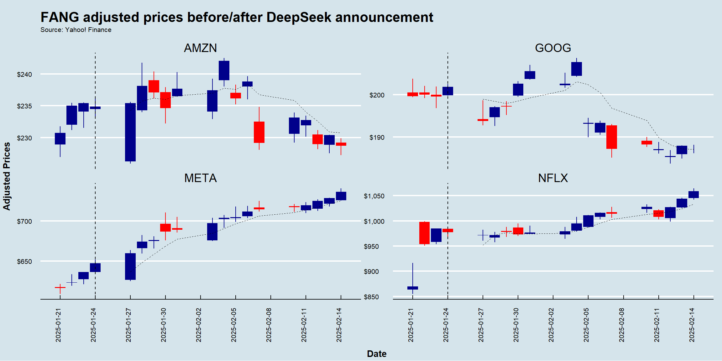
For a thorough discussion, see a detailed discussion on tidyquant’s charting capabilities here.
Alternatives to ggplot2
The ggplot2 package is, by and large, the richest and most widely used plotting ecosystem in the language. However, there are also other interesting options, especially when it comes to interactive data visualization
The plotly ecosystem provides interactive charts for R, Python, Julia, Java, among others - you can install the
Rpackage usinginstall.packages('plotly')The Highcharts is another option whenever there is a need for interactive data visualization - you can install the
Rpackage usinginstall.packages('highcharter')
In special, the highcharter package works seamlessly with time series data, especially those retrieved by the tidyquant’s tq_get() function.
#Install the highcharter package (if not installed yet)
#install.packages('highcharter')

#Load the highcharter package (if not loaded yet)
library(highcharter)

#Select the Google Stock with OHLC information and transform to an xts object
GOOG=tq_get('GOOG')%>%select(-symbol)%>%as.xts()

  #Initialize an empty highchart
  highchart(type='stock')%>%
  #Add the Google Series
  hc_add_series(GOOG,name='Google')%>%
  #Add title and subtitle
  hc_title(text='A Dynamic Visualization of Google Stock Prices Over Time')%>%
  hc_subtitle(text='Source: Yahoo! Finance')%>%
  #Customize the tooltip
  hc_tooltip(valueDecimals=2,valuePrefix='$')%>%
  #Convert it to a 'The Economist' theme
  hc_add_theme(hc_theme_economist())
Hands-on Exercise
- In late January 2021, Reddit traders took on the short-sellers by forcing them to liquidate their short positions using GameStop stocks. This coordinated behavior had significant repercussions for various investment funds, such as Melvin Capital - see here and here
Instructions
- Use
tq_get()to load information for GameStop (ticker: GME) and store it in adata.frame. Using the argumentsfromandtofromtq_get(), filter for observations between occurring in between December 2020 (beginning of) and March 2021 (end of) - Use
ggplot(aes(x=date,group=symbol)), along withgeom_candlestick()and its appropriate arguments, to chart the historical OHLC prices - Create a vertical line annotation using
geom_vline, setting thexinterceptargument to the date of the Reddit frenzy (as.Date('2021-01-25')) - Use the theme from The Economist calling
theme_economist(). Make sure to have theggthemespackage installed and loaded - Finally, call
theme()andlabs()to adjust the aesthetics of your theme and labels as you think it would best convey your message. For example, you can use thescalespackage to format the appearance of your x and y labels (for example, displaying a dollar sign in front of adjusted prices)
Solution walkthrough
#Libraries
library(tidyquant)
library(tidyverse)
library(ggthemes)
library(scales)

#Setting start/end dates + reddit date
start='2020-12-01'
end='2021-03-31'
reddit_date=as.Date('2021-01-25')

#Get the data
tq_get('GME',from=start,to=end)%>%
  #Mapping
  ggplot(aes(x=date,group=symbol))+
  #Geom
  geom_candlestick(aes(open = open, high = high, low = low, close = close))+
  #Labels
  labs(x='',
       y='Adjusted Prices',
       title='GameStop (ticker: GME) prices during the reddit (Wall St. Bets) frenzy',
       subtitle='Source: Yahoo! Finance')+
  #Annotation
  geom_vline(xintercept=reddit_date,linetype='dashed')+
  annotate(geom='text',x=reddit_date-5,y=75,label='Reddit Frenzy Starts',angle=90)+
  #Scales
  scale_x_date(date_breaks = '2 weeks') +
  scale_y_continuous(labels = dollar) +
  #Custom 'The Economist' theme
  theme_economist()+
  #Adding further customizations
  theme(legend.position='none',
        axis.title.y = element_text(vjust=+4,face='bold'),
        axis.title.x = element_text(vjust=-3,face='bold'),
        plot.title = element_text(size=10),
        plot.subtitle = element_text(size=8,vjust=-2,hjust=0,margin = margin(b=15)),
        axis.text.y = element_text(size=8),
        axis.text.x = element_text(angle=45,size=8,vjust=0.75))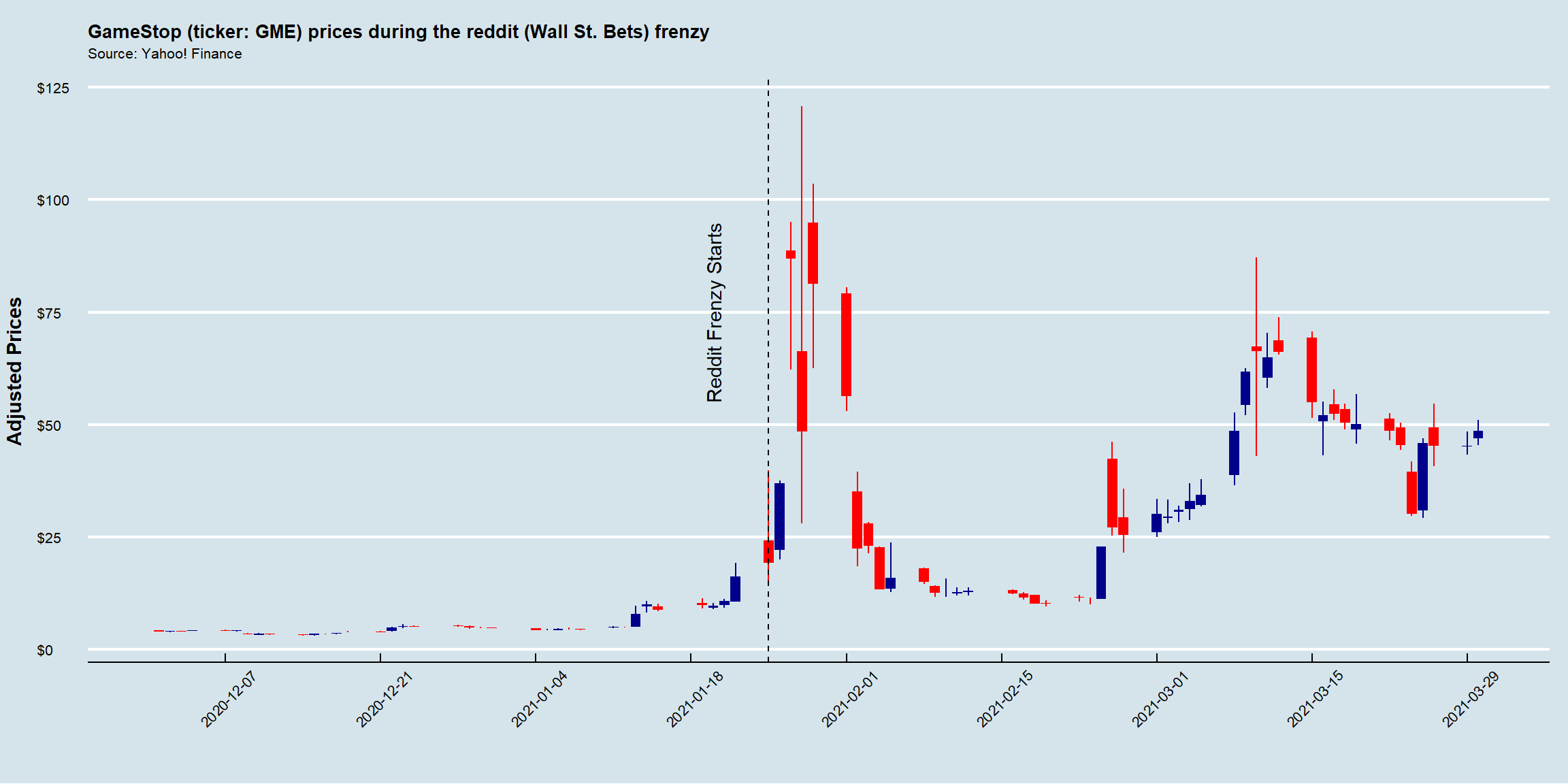
This code visualizes GameStop (GME) stock prices during the Reddit (Wall Street Bets) frenzy in early 2021 using a candlestick chart. It retrieves stock data from Yahoo! Finance, applies ggplot2 for visualization, and customizes the plot using ggthemes.
Define Date Ranges. These dates specify the period over which GME stock data will be retrieved. More specifically,
startandendare used to filter thetq_get()function, whereasreddit_datemarks the key event when WallStreetBets (WSB) discussions fueled the GME rally, and will be used in theggplotcall to annotate the exact period where the frenzy happened.Retrieve Stock Data. The
tq_get()fetches stock price data for GameStop (GME) from Yahoo! Finance. It returns a data frame with the following columns:date,open,high,low,close,adjusted,volume.Create Candlestick Chart. While the
ggplot(aes(x = date, group = symbol))creates a basicggplotchart, thegeom_candlestick(aes(open = open, high = high, low = low, close = close))maps the specific variables onto the OHLC information.Add Labels. Using the
labs()function, it is possible to customize several aspects of the chart, such as thexandylabels, as well as thetitleandsubtitle.Annotate the Reddit Frenzy date. The
geom_vline() adds a dashed vertical line atreddit_date(Jan 25, 2021) to highlight the Reddit-driven rally. More specifically, the function places a text label “Reddit Frenzy Starts” near the line,x = reddit_date - 5shifts text 5 days to the left for better visibility,y = 75positions it at $75, andangle = 90rotates the text vertically.Customize Axes. The
scale_x_date(date_breaks = '2 weeks')ensures the x-axis shows date breaks every 2 weeks, while thescale_y_continuous(labels = dollar)formats y-axis values as dollar amounts.Apply and customize predefined themes. The
theme_economist()function applies a professional, clean theme fromggthemes, inspired by The Economist famous financial charts. On top of that, thetheme()function edits various aspects of the predefined theme, such as bold titles, font sizes, and more, to better convey the message.
Exploring ggplot2 beyond this lecture
The ggplot2 package is an incredibly vast and flexible data visualization package. While this lecture covers the core concepts and essential functions, it is impossible to cover every aspect of ggplot2 in a single session. The package includes a wide range of geometric objects (geoms), themes, and customization options, along with an extensive ecosystem of extensions that add even more functionality.
For further exploration, students are encouraged to refer to the following resources:
Complete List of Geoms (geometric objects): learn about all available geom functions, such as
geom_violin(),geom_ribbon(), and more - click hereThemes in ggplot2: explore built-in themes like
theme_minimal(),theme_classic(), and specialized options such astheme_void()- click hereTheme Customization: customize every visual element of a ggplot, including fonts, margins, grid lines, and legend positions - click here
Extensions: discover additional packages that enhance ggplot2 with interactive features, advanced annotations, and more - click here
By exploring these resources, you can unlock the full potential of ggplot2 and create even more powerful and visually compelling data visualizations.